Session 5 — AMCHSS COVID-19 Dashboard

15:30 – 16:30 | Walkthrough + concept mapping

Dr. Arun Mitra

What Is the AMCHSS Dashboard?

Built at AMCHSS, SCTIMST Trivandrum (Prof. Biju Soman’s group). A live R + flexdashboard + shiny COVID-19 surveillance and modelling tool for India.

Five panels: Home · Epidemic Curves · Epidemiological Parameters · Projections · About.

https://amchss-sctimst.shinyapps.io/covid_dashboard/

How to Watch

For each panel, ask:

  1. What question is it answering?
  2. What input data does it need?
  3. Which method from today sits behind it?
  4. What’s the uncertainty?

The handout has a 4-column table — fill it as we go.

Panel 1 — Home

Five value boxes (Confirmed · Active · Recovered · Deceased · % Active in last week), three map tabs (Deaths per 1000 · Active per lakh · % >18 yrs vaccinated), and a 14-day moving-average epicurve.

From today: descriptive epi + the line list → incidence → plot pipeline.

Panel 2 — Epidemic Curves

State selector → interactive dygraphs curve. The “First and Second Waves” tab overlays log-linear fits per wave.

The dashboard fits a log-linear incidence::fit() to each wave — same idea as our glm(I ~ date, family = poisson()).

Panel 3 — Epidemiological Parameters

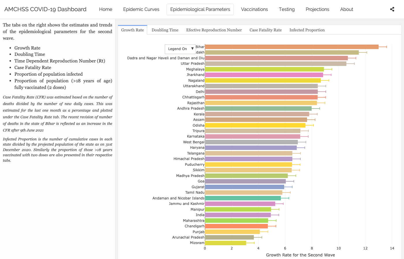
  • Growth Rate — log-linear r per state, 95% CI (Wave 2 default).
  • Doubling Timelog(2) / r, same fits.
  • Effective Rt — 3D plotly ribbon, per state, over time.
  • Case Fatality Rate — last 30 days, daily.
  • Infected Proportion — cumulative cases / projected 2020 population.
  • Vaccinated Proportion — % of >18 yr population fully vaccinated.

Above: the Growth Rate tab (log-linear r by state, 95% CI). The Effective Rt tab is a 3D plotly ribbon — best seen live.

Method: R0::est.R0.TD() — Wallinga & Teunis (2004) time-dependent R, gamma generation time (mean 4.4, sd 3 days), 95% bootstrap CI per state.

Same renewal-equation family as our Foundations demo. Different package (R0 vs EpiEstim), different smoothing — same idea.

Panel 4 — Projections

State selector → 15-day forward forecast of daily incidence using projections::project() — branching-process simulation seeded with the recent log-linear fit. The faint forecast lines at the right edge fan by assumed change in Rt.

Panel 5 — About

Team at AMCHSS / SCTIMST. Methodology references (Mitra et al. 2020, PLOS ONE). Data attribution to covid19india.org.

A dashboard’s About page is part of the methodology. Always read it.

The Stack

  • R — everything we did today.
  • flexdashboard + shiny — single Rmd, multiple panels.
  • Daily ingest from api.covid19india.org.
  • Analyticsincidence for fits, R0::est.R0.TD for Rt, projections for forecasts.
  • Geospatialsf + mapview + leaflet.
  • Hosting — shinyapps.io free tier.

What’s in the Repo

amchss_covid_dashboard/
├── covid_dashboard.Rmd           # the flexdashboard
├── 1_analysis_code_run_sequence.R   # rebuild all RDS outputs
├── Rscripts/
│   ├── load_packages.R · load_data.R · tidy_data.R
│   ├── statewise_epidemiological_parameters.R   # R0, growth rate, doubling time
│   ├── statewise_projections.R · vaccine.R
│   └── homepage_fig1.R · value_boxes.R
├── data/   # state shapefiles, population
└── rds/    # pre-computed analytic outputs

Pattern: heavy compute → .rds cache → fast dashboard load. Fits run nightly; the dashboard reads the cached output.

A Mini-Dashboard in 25 Lines

library(shiny); library(flexdashboard); library(EpiEstim)
covid <- readr::read_csv(here::here("data", "covid_india_daily.csv")) |>
  dplyr::transmute(dates = date, I = as.integer(daily_confirmed))

ui <- fluidPage(
  titlePanel("Mini R(t) Dashboard"),
  sliderInput("window", "Sliding window (days)", 3, 14, value = 7),
  plotOutput("rt_plot")
)

server <- function(input, output) {
  output$rt_plot <- renderPlot({
    n <- nrow(covid)
    rt <- estimate_R(
      incid  = covid,
      method = "parametric_si",
      config = make_config(list(
        mean_si = 4.7, std_si = 2.9,
        t_start = seq(2, n - input$window),
        t_end   = seq(2, n - input$window) + input$window
      ))
    )
    plot(rt, "R")
  })
}

shinyApp(ui, server)
1
UI — what the user sees. Pure markup, no logic.
2
An input with inputId = "window" — the server reads it as input$window.
3
An output slot named rt_plot — paired with output$rt_plot in the server.
4
Server — the logic. Shiny re-runs the relevant blocks whenever any input they depend on changes.
5
The output ID (rt_plot) matches the UI slot — that’s how Shiny wires them together.
6
The reactive read. This line is the dependency — when the slider moves, this expression re-evaluates and the plot updates.
7
One line ties UI and server together. Run this in RStudio and the app launches.

The AMCHSS dashboard is many of these, composed.

Design Choices

  • Geography — national or state? Aggregate hides heterogeneity; disaggregate adds noise.
  • Time window — 7 days? 14 days? Affects Rt smoothness and delay.
  • Rt method — Cori, Wallinga–Teunis, EpiNow2 — different smoothing, different uncertainty model.
  • Uncertainty display — credible intervals, fan plots, or none?
  • What’s not shown — biases, data caveats, assumed serial interval. How would you surface these?
  • Audience — public, journalists, policy-makers, clinicians?

Where Did This Help?

  • Wave 2 (2021) — real-time Rt informed state-level lockdown decisions.
  • Vaccine rollout — coverage maps highlighted lagging districts.
  • Wave 3 (Omicron) — fast doubling time made the Doubling Time tab the most-watched one.
  • Capacity planning — 15-day projections fed ICU bed allocation.

A dashboard is infrastructure. The methods underneath it are what we taught today.

What Would You Build?

In one sentence each:

  • Disease?
  • Audience?
  • Single most important panel?