Just Enough R for IDM

Dr. Arun Mitra Peddireddy
JHAPSMCON 2026
4th Annual Jharkhand State Conference of IAPSM

Why R for IDM?

  • Free and open-source — everywhere, no licence fees.
  • The IDM ecosystem lives in RdeSolve, EpiEstim, epidemics, EpiNow2, incidence2, outbreaks, socialmixr.
  • Reproducible — your script is your method. Re-run it in five years and get the same numbers.
  • One language for the whole pipeline — clean → analyse → model → plot → publish.

RStudio in 4 Panes

Pane What it does
Source Your script — write code, save it
Console R runs here. Output prints here
Environment Objects R knows about right now
Plots / Help / Files Plots, ?docs, your project files

Run a line: Ctrl/Cmd + Enter.

Common errors:

  • “object not found” → you didn’t run the line that creates it.
  • “could not find function” → package not loaded.

Part I: R Basics

Assignment and Vectors

x <- 5                          # assign 5 to x
x                               # print x  →  [1] 5

ages <- c(25, 30, 35, 40)       # a numeric vector
mean(ages)                      # → 32.5
length(ages)                    # → 4

Use <- for assignment. = works too but <- is the convention. c() combines values into a vector — the smallest unit of data in R.

Functions and Arguments

mean(ages)                      # one positional argument
mean(x = ages, na.rm = TRUE)    # named arguments

# Type ?mean in the console for help
?mean

Arguments can be positional (in order) or named (name = value). Named beats positional for clarity — always name the second argument onward.

Data Types

is.numeric(3.14)                # TRUE
is.character("Kerala")          # TRUE
is.logical(TRUE)                # TRUE

# Vectors: same type only
c(1, 2, 3)                      # numeric
c("Kerala", "TN", "AP")         # character
c(TRUE, FALSE, TRUE)            # logical

# Mixed types coerce to character
c(1, "Kerala", TRUE)            # → "1" "Kerala" "TRUE"

The four types you’ll meet most: numeric · character · logical · factor.

Loading Packages

install.packages("tidyverse")   # one-time, on a new machine

library(tidyverse)              # every R session, before use
library(EpiEstim)
library(here)

install.packages() is once. library() is every session. If you see “could not find function”, you forgot the library() call.

Subsetting Basics

ages <- c(25, 30, 35, 40)

ages[1]                         # first element            → 25
ages[c(2, 4)]                   # multiple elements        → 30, 40
ages[ages > 30]                 # logical subset           → 35, 40

# Data frames: $ for columns, [] for rows / cols
mtcars$mpg                      # the mpg column
mtcars[1, ]                     # first row, all columns
mtcars[, "mpg"]                 # all rows, mpg column

Part II: Tidyverse Principles

Tidy Data

Three rules:

  1. Each variable in its own column.
  2. Each observation in its own row.
  3. Each value in its own cell.

A line list is tidy data: one row per case, one column per attribute.

case_id onset gender
1 2014-04-01 F
2 2014-04-03 M
3 2014-04-04 F

The Pipe Operator

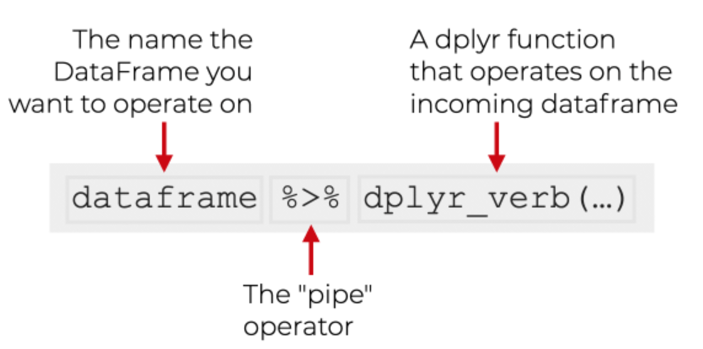
Read |> out loud as “and then…”. x |> f() is the same as f(x). x |> f() |> g() is g(f(x)).

Reading Data

library(readr)
library(here)

covid <- read_csv(here("data", "covid_india_daily.csv"))
  • read_csv() from readr is faster and tidier than base R’s read.csv() — it returns a tibble.
  • here() builds project-relative paths. Use it instead of absolute paths — your code will work on any machine.

Part III: The dplyr Verbs

Five Verbs Cover 90% of Data Work

Verb What it does
filter() Keep some rows
select() Keep some columns
mutate() Make new columns
arrange() Reorder rows
group_by() + summarise() Collapse rows by group

Combine with the pipe |> for readable, sequential transformations.

filter() function - Keeps the Rows

covid |>
  filter(daily_confirmed > 100000)

covid |>
  filter(date >= "2021-03-01",
         date <= "2021-06-30")

Multiple conditions joined with comma = AND. Use | for OR.

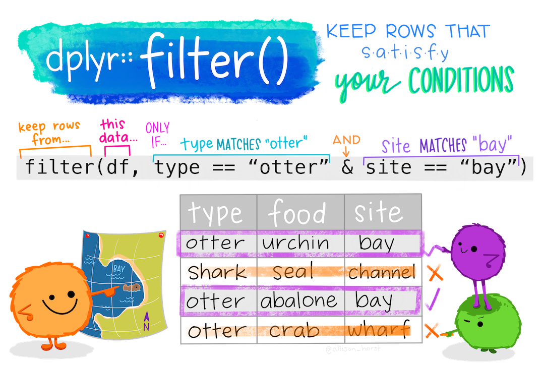
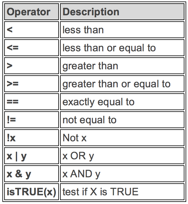
Logical Operators in filter()

covid |>
  filter(daily_confirmed > 100000)

covid |>
  filter(date == "2021-05-06")

covid |>
  filter(!is.na(daily_confirmed))

covid |>
  filter(date >= "2021-03-01" &
         date <= "2021-06-30")

select() function: Keeps the Columns

covid |> select(date, daily_confirmed)        # keep two columns

covid |> select(-cumulative_confirmed)        # drop one column

covid |> select(starts_with("daily"))         # tidy-select helpers

starts_with(), ends_with(), contains(), matches() (regex) all work inside select().

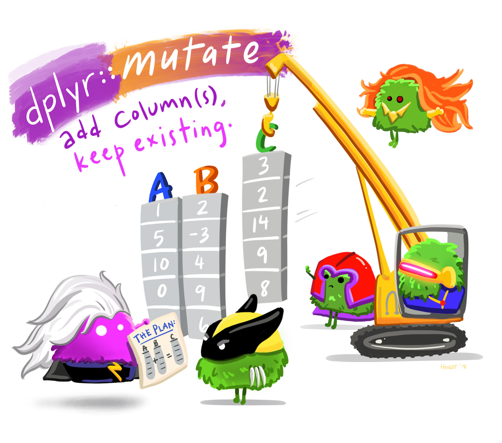
mutate() function: Makes New Columns

Illustration © Allison Horst, CC-BY 4.0.

covid |>
  mutate(
    week  = lubridate::floor_date(date, "week"),
    cases_per_lakh = daily_confirmed / 13800
  )

mutate() creates new columns or overwrites existing ones.

arrange() — Reorder Rows

covid |> arrange(daily_confirmed)              # ascending

covid |> arrange(desc(daily_confirmed))        # descending — peak day first

covid |> arrange(date)                         # chronological

Default is ascending. Wrap with desc() for descending.

group_by() + summarise() — Collapse by Group

covid |>
  mutate(year = lubridate::year(date)) |>
  group_by(year) |>
  summarise(
    total_cases = sum(daily_confirmed, na.rm = TRUE),
    peak_day    = max(daily_confirmed, na.rm = TRUE),
    n_days      = n()
  )

The most powerful pattern in dplyr. Group, then collapse. n() counts rows in the current group.

Part C: Plotting with ggplot2

The Grammar of Graphics

A plot is built in layers:

  1. Data: the tibble you’re plotting.
  2. Aesthetics: aes() maps columns to position, colour, size.
  3. Geoms: the visual shapes: geom_line, geom_col, geom_point.
  4. Scales: how to translate values to pixels (axes, colour palettes).
  5. Facets: small multiples by a categorical variable.

A Plot, Built Up

covid |>
  ggplot(aes(x = date, y = daily_confirmed)) +
  geom_col(fill = "steelblue") +
  scale_y_continuous(labels = scales::comma) +
  facet_wrap(~ lubridate::year(date), scales = "free_y") +
  labs(x = NULL, y = "Daily confirmed",
       title = "COVID-19 India — in waves")
1
The data — must be a tibble or data frame.
2
aes() maps date → x-axis, daily_confirmed → y-axis.
3
Bars, filled steel blue.
4
Format y-axis with thousand separators.
5
One panel per year. free_y lets each year find its own scale.
6
Labels and title.

The Plot

covid |>
  ggplot(aes(x = date, y = daily_confirmed)) +
  geom_col(fill = "steelblue") +
  scale_y_continuous(labels = scales::comma) +
  facet_wrap(~ lubridate::year(date), scales = "free_y") +
  labs(x = NULL, y = "Daily confirmed",
       title = "COVID-19 India — three waves")

Common Geoms

Geom Use for…
geom_line() Trends over time
geom_col() Bars (counts already computed)
geom_bar() Bars (compute counts from raw data)
geom_point() Scatter plots
geom_histogram() Distribution of one numeric variable
geom_boxplot() Distribution by group
geom_smooth() Trend line through points

Part E — Putting It Together

The Line List → Plot Pipeline

library(tidyverse)
library(outbreaks)
library(lubridate)

ll <- outbreaks::ebola_sim_clean$linelist |> as_tibble()

ll |>
  filter(!is.na(date_of_onset)) |>
  mutate(month = floor_date(date_of_onset, "month")) |>
  group_by(month, gender) |>
  summarise(cases = n(), .groups = "drop") |>
  ggplot(aes(month, cases, fill = gender)) +
  geom_col(position = "dodge") +
  labs(x = "Month", y = "Cases",
       title = "Ebola simulated outbreak — monthly cases by gender")

Five verbs. One pipeline. Read it top-to-bottom as English.

The “Epi Way” — Two Lines, Same Plot

library(incidence2)

inc <- incidence(ll, date_index = "date_of_onset",
                 interval = "week", groups = "gender")
plot(inc)

Same idea — three lines instead of seven. Epi packages give you tidy shortcuts for common patterns. Bridge to Rt in Foundations.

Activity — Try It Yourself

In your project, open activity_02_pipeline.R:

  1. Change the grouping in the Ebola pipeline from gender to hospital.
  2. Switch the interval from "month" to "week".
  3. Change the geom from geom_col to geom_line.
  4. Add a geom_smooth() layer to overlay a trend.

Part F — Applied: Rt from Indian COVID-19 Data

COVID-19 India — Daily Cases

library(tidyverse); library(EpiEstim); library(here)

covid_india <- read_csv(here("data", "covid_india_daily.csv"),
                        show_col_types = FALSE) |>
  transmute(dates = as.Date(date),
            I     = as.integer(daily_confirmed)) |>
  arrange(dates) |>
  filter(!is.na(I))

covid_india |>
  ggplot(aes(dates, I)) +
  geom_col(fill = "steelblue") +
  scale_y_continuous(labels = scales::comma) +
  labs(x = NULL, y = "Daily confirmed cases",
       title = "COVID-19 India — JHU CSSE, 2020-01 to 2023-03")

Estimate Rt Nationally

# SARS-CoV-2 serial interval (Nishiura et al. 2020): mean 4.7, sd 2.9
rt_fit <- estimate_R(
  incid  = covid_india,
  method = "parametric_si",
  config = make_config(list(mean_si = 4.7, std_si = 2.9))
)

plot(rt_fit, "R")
1
The data: a tibble with dates and I (daily incidence). One row per day.
2
parametric_si — serial interval is a known parametric distribution (gamma).
3
Mean and SD of the SI in days. Change these and Rt shifts.
4
Plot just the Rt panel. plot(rt_fit) shows all three.

Above 1 → wave growing. Below 1 → wave shrinking. Always read the credible interval.

R0 from the Early-Wave Growth Rate

For a quick R0 from the start of a wave, fit a log-linear model and convert:

wave2_start <- covid_india |>
  filter(dates >= as.Date("2021-03-01"),
         dates <= as.Date("2021-03-21"))

fit <- glm(I ~ as.numeric(dates), data = wave2_start, family = poisson())
r   <- coef(fit)[2]
Tg  <- 4.7
R0_wave2 <- 1 + r * Tg
R0_wave2
1
First 21 days of Wave 2 — Delta growing exponentially before susceptibles deplete.
2
Poisson GLM with a log link. The slope is the log of the daily growth multiplier.
3
Pull the slope out as a scalar.
4
Generation time mean (days).
5
Wallinga & Lipsitch (2007): in the early phase, R0 ≈ 1 + r · Tg.

Activity — Rt Across Three Waves

Open activity_02_waves.R. Three teams, one wave each:

Team Wave Window (illustrative)
1 Wave 1 2020-06-01 → 2020-12-31
2 Wave 2 2021-03-01 → 2021-06-30
3 Wave 3 2021-12-15 → 2022-02-28

For your wave:

  1. Filter the data to the window.
  2. Run estimate_R() with the SARS-CoV-2 serial interval.
  3. Note the peak Rt, when it crossed 1, and the width of the credible interval.
  4. One sentence: what does this tell you about that wave?

If you can read it, you can write it.